Pages

Tuesday, August 31, 2010

Making Money

Want some of this?

Have one of these!!!

This past weekend my hubby and I had a garage sale (with the help of my mom!). I had been collecting stuff in our garage that we just didn't need anymore... kids clothes, toys, shoes, house decorations...you name it & it was there! I planned on taking pictures of all my loot...but if you have done a garage sale you know how EARLY you rise and my brain just didn't think in regards to the blog...and I had a feeling my mom & husband would have thought I was craaazy. :)

Here are my tips for a succesful garage sale...
1. Advertise in your local paper.
2. Place an ad on Craiglist & place signs around your neighborhood.
3. Sort your items into like categories and label if possible. For example: I went through all the kids clothes and sorted by size...then placed into tubs with labels showing 18-24 mo (GIRLS).
4. Do bulk pricing for clothes. Instead of having a set price for clothes (which you know someone will balk at anyway) tell your customers to bring you a stack and then you'll tell them a price for it all.
5. Be PREPARED for mayhem! Inevitably you'll get a couple of ladies who will bring you a TON of stuff (in my case TWO tubs full of clothes) and want a price for it all.
6. Be WATCHFUL -- in the case of the above scenario watch for people who will add to their pile after you've quoted them a price.
7. Get out EARLY!! Be prepared for people to be stopping by 30 minutes before you're really opening up for sale.
8. Whatever doesn't sell have Goodwill, Salvation Army, Habitat, Sand Dollar, etc. come pick up or drop it off yourself. Don't be tempted to keep it for the 'next' garage sale!

Get after it!! Make some $$$$.

Anyone have any other great tips for hosting a garage sale? Please share...I have a feeling this may be a yearly thing for us.

Monday, August 30, 2010

Living room rearrange

This is my living room. Sad, I know. It's been in this sad state since we moved into our new house, mostly because I can't figure out what to do with it. It's a large room that's lacking personality. We spend 90% of our time in here & it's my least favorite room in the house!
It needs help! Can you help me??
These are the things I DO NOT like about it...
1. Seeing the back of the couch from the kitchen. It's just NOT inviting.
2. Feeling overrun with toys.
3. No curtains, no rug, no texture of any kind.
4. Blank walls. Need I say more??
here are a few more shots...
Sad. Right?? Well, I had had enough of it this weekend. I was determined to do something about it & to do it, without spending any money.
So here we go...
First things first. I moved the couch. It only needed to scoot about 3 feet, but it made a BIG difference. I angled it away from the corner so that it wouldn't be against the wall. I'm not sure why, but I'm just not a fan of couches on walls. I also borrowed these curtains from my guest room. I'll come back to those...
I then stashed the toy baskets behind the couch. They're now out of the way but still accessible to my girls.
I moved the big bulky chairs that were in front of the windows (actually covering the windows) to the opposite side of the room. So while I still have nothing on this wall, I at least now have something over there.
I then positioned these 2 smaller chairs in front of the windows. This red one was in our bedroom, but I think it fits better in here.
Lastly I brought in this old rug from the garage & set it in front of the couch. It's a little bare & a little raggedy, but it will do for now. I moved the kids' table to the end of the couch as a makeshift end table. The kids & hubby seem to like it's new home, so it may hang out there for a while.
And here's the result! What do you think??
Overall, I'm pretty happy with it. It's definitely better than it was last week!
I'm still uncertain about the curtains, the rug & of course the walls!

And that's where I need your help!!

First, the curtains... I love them close up, (with the flowers on top & leopard on the bottom) but from the kitchen you can't see any of the leopard print & I feel like they look very...70s-ish. Am I crazy?? Be honest ladies. No hard feelings!!

Next, the rug. It's got to go, I know, but what do I replace it with? I'm leaning towards something neutral, but I need suggestions!

Lastly, the walls!! Where do I even begin? The one on the left is so big & overbearing, that I feel like it needs to be anchored with something or a couple of somethings..well..that are big..
What are your thoughts??

Seriously. I can't wait to hear some of your fabulous ideas!!

thanks!
Sumo's Sweet Stuff
Making
The DIY Show Off

Friday, August 27, 2010

Board & Batten

About 6 months ago we moved our twins out of their cribs and into twin beds. The last 6 months have been a decorating nightmare for me! I have had the hardest time figuring out how to make a boy/girl twin two-year old room look cute. One of the biggest problem areas was this long blank wall.


It used to be the wall their cribs were up against but putting twin beds on this wall took up too much of the floor space. I came up with another solution for the beds which you'll see in a later post. I already have enough furniture in the room with 2 nightstands, 2 twin beds and a tall dresser so putting furniture along this wall was not an option. After scouring the internet I decided to try Board & Batten and my fantastic hubby willingly went along with it once I showed him pictures of it.

We started by painting the wall about 3/4 high with a glossy white paint.

We went to a hardware store and purchased 4x8 sheet of MDF and had the guys cut them into 2" strips. We also bought a 12' long pre-primed 1x6 for the top border. I layed them all out in the garage and painted away...although you could wait and paint them once they are up on the wall if you wanted. Ignore the 3 wide planks in the picture below. Those didn't work out and we went back to buy the aforementioned 12' 1x6.

My handsome helper mitred the ends of each plank so that the transition from plank to baseboard wouldn't be so awkward. My little guy decided to get an early start on learning 'boy' stuff.

In the process of this project we bought a new (and slightly expensive) toy that we need to use for other projects very soon to justify the purchase of this and the compressor.

Here's a close up detail of the bottom of the plank.

After it's all up on the wall we filled in the nail holes with wood filler, sanded and touched up the paint.

Finished product! I'm sorry the photo angle is so awkward... Remember my unfortunate camera incident? Well, my temporary until I can afford a new lens is a 35-80mm so everything is much closer than it was when we did this project. Picture me up on a bed squishing myself as far as I can into the corner of the room and I still couldn't get the whole wall in one shot!! Hopefully you can get the idea here.

Now the wall appears full without any additional furniture. I love love love it!! I think I'd have B&B or beadboard in almost every room of my house if that wasn't absolutely crazy!!

I'm linking here:
Finding Fabulous
It's a Blog Party
The Shabby Nest
Remodelaholic
Chic on a Shoestring Decorating
Trendy Treehouse

Thursday, August 26, 2010

Quick Change {Baskets}

After reorganizing my mudroom this week, I've been looking for other ways to use baskets around the house. I thought I could spruce up these toy baskets in the living room.
I dumped out everything, which my girls LOVED!
I then had plenty of time to glamorize my baskets.
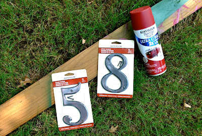
I spray painted these address numbers with some red paint that I had used for another project.
I tied the numbers on with string thinking that was all it would take, but then when back with a few drops of hot glue to fully secure them to the baskets. Knowing my girls, string alone would not have cut it.
And here they are!
Freshly organized, newly embellished toy baskets.


giveaways

NightOwlCrafting

Get your craft on Thurs.

Wednesday, August 25, 2010

{Recipe} Company Chicken

We're back with another tasty recipe. This time it's Company Chicken from a church cookbook! Yum-o! Those ladies at FBCTW know how to cook! :)

Ingredients:

6 skinless, boneless chicken breasts (I only used 4 and it worked out okay too)
6 slices of Provolone cheese
10 3/4 oz. can cream of chicken soup
1/2 soup can of water
1 stick unsalted butter, melted
2 cups herb-seasoned stuffing mix or crushed croutons

In 9x13 inch greased baking dish, arrange chicken and top each piece with cheese. Mix soup and water and pour over chicken. For topping, mix melted butter and stuffing mix and sprinkle over chicken. Bake uncovered at 350* for 45 min. or until done.


This one is a man-pleaser (at least my man!). I fed it to my family plus my 22 year old brother and they both gave it good reviews. Hope you have the same results. Enjoy!!


I'm linking here:
We are THAT Family
Me and My Bucket
Blue Cricket Design
The Trendy Treehouse

Monday, August 23, 2010

mudroom fix-up

This is what I had in mind when we built our mudroom.
Straight out of Pottery Barn.
Unfortunately, this is what our mudroom looks like.
A complete eyesore. Bags, toys & stuff piled everywhere!
Seriously. I did not "prep" it to look this bad.
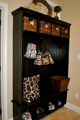
So I went to work. I cleared off everything & added these baskets
to help organize the smaller things.
I made individual label tags to help me remember
where I stashed everything.
I decorated the top with knick knacks that I found around the house, including the moss balls I made a few weeks ago.
And voila! Sooo much better! Now if only I can keep it looking this good.
I added an extra bucket on the bench with high hopes of throwing random things in it, rather than letting it collect on the bench. Wish me luck!

Making


Keeping It Simple


mmm button